
How my home giclée printing process has evolved using Canon’s professional range
About
I remember reading that if you’re an artist who wants to create prints, you should outsource: this keep costs low while letting experts handle all aspects of production. As attractive as this may seem, one thing tipped the balance for me in favour of printing my own prints at home, and that’s knowing I could learn and grow from the process as a print artist. Here’s how my home studio giclée printing process has evolved, using Canon’s professional range.
Share this article
Discover the full video
Lesson learned: Don’t be afraid to own your entire printing process
When I first began researching home printing techniques, I knew that I wanted my work to meet a fine art standard and look consistently crisp and vibrant every time, with minimal risk of fading and discoloration over time. A little research helped me understand why giclée would be ideal for me: since appearing in the 1980s, giclée has become the benchmark for high quality inkjet reproduction. It’s a printing technique which offers a rich and deep print finish, typically to light-fast archival quality, with the most accurate match to a composition’s original colour and level of detail. The world of giclée is technically complex so even though there was a lot to sink my teeth into I knew there was also much to be excited about, knowing that artists could now easily access professional grade printing at home – and that’s something I didn’t want to take for granted.
Things feel a little nostalgic for me now, as I’ve recently been given the opportunity to try out Canon’s imagePROGRAF PRO-300 printer. Looking back at when I started my print journey four years ago, I don’t remember considering any other make than Canon: my first printer of choice was a Canon PIXMA PRO-10S, which exceeded my expectations, and I carried on using seamlessly for over three years. Both devices present powerful features, but also differ in more ways than none, so read on if you’re curious to find out how my creative practice has evolved with the PRO-300. Keep going to also learn about my fine art paper recommendations, and other tips for photographing, packaging and storing art prints, for a well-rounded and fail-proof printing process.

Comparing a giclée print reproduced on the Canon imagePROGRAF PRO-300 inkjet (left) with a laserjet print (right), both printed on 250gsm matte card
A more seamless and effortless process
What I love most about owning my entire printing process is the flexibility I get over my workflow, as well as the self-assurance and room it gives me to grow as an artist. I can now keep production on-demand and low waste, and by understanding giclée printing from a technical standpoint, I’ll also know how to make rapid adjustments my images or brief external printers with more confidence should I ever need to outsource prints. Maintaining control over my process from start to finish means being able to do important tests for colour accuracy and quality assurance, which Canon’s PRO-300 notably allows with its ‘Professional Print & Layout’ software suite for added workflow seamlessness.
As an artist working from a home studio, I just have to be smart with how I use my space. Compared with the bulkier PRO-10S, the PRO-300 has a more compact profile, making it a more versatile and user-friendly piece of equipment. Wi-Fi printing, something I always struggled to get right previously, was a breeze to set up meaning that I can now enjoy printing from multiple devices and any room in my home. The PRO-300’s interactive LCD screen also makes printing easier without needing to use a computer.
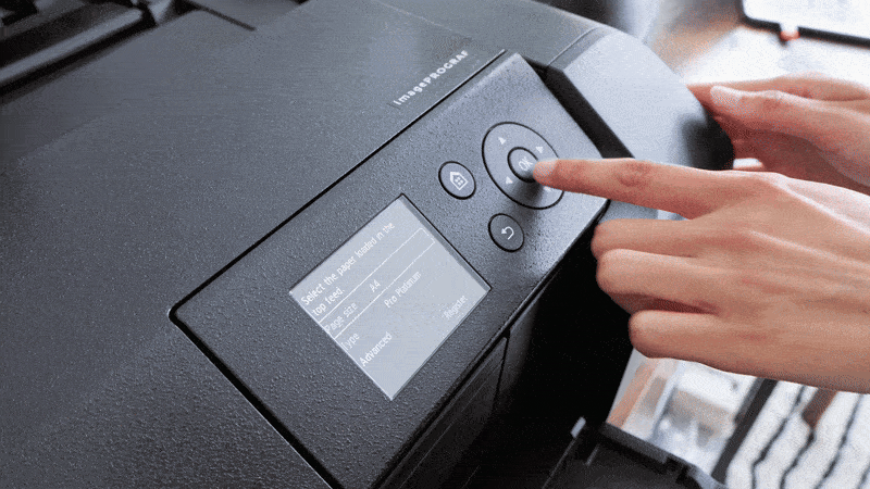
Some of my personal highlights using the PRO-300, from seamless Wi-Fi setup to remote printing
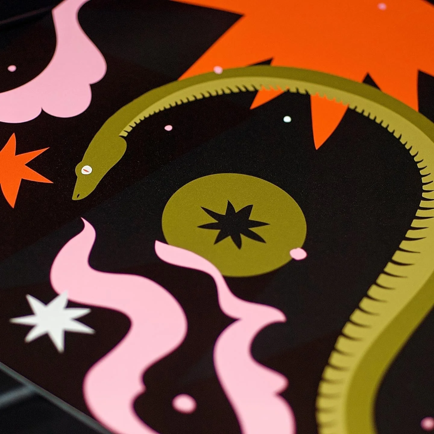
One key printing consideration for any artist is colour accuracy. The PRO-300 uses the 10-colour, pigment-based LUCIA PRO ink system which includes a Chroma Optimizer. This system has a wider gamut resulting in more vibrant and uniform colours with superior archival qualities which, when paired with colour grading software features like Pattern Print, allow for highly accurate professional-grade output. While the PRO-10S also uses a 10-colour LUCIA ink system, its features appear less advanced: even though my older prints were already stunning in their depth and contrast, the PRO-300 has a newly formulated Matte Black ink which I’ve particularly enjoyed for my black-heavy and monochrome artworks.
The PRO-300 and PRO-10S are also practically on par where media handling is concerned: both are compatible with a wide selection of exceptional fine art and photo papers, with official ICC profiles set up for more accurate reproduction. I’ve been interested in exploring scroll-length art prints inspired by traditional woodblock printing, so one aspect I’m most excited about testing is the PRO-300’s ability to print panoramic sizes up to 39” in length, using thicker fine art papers as well as printing borderless on these media types, features previously not supported by the PRO-10S.
I have also noticed improved turnaround times so far, using the PRO-300 compared with the PRO-10S. This experience may be slightly skewed though, as it will depend on the nature of your prints (such as vibrancy or intensity of black), as well as the quality you are printing it at and your paper of choice. For example, baryta paper (which was developed to replicate analog darkroom papers) and similarly textured papers will force prints to higher quality settings and therefore pull more ink, whereas satin or matte paper choices can be processed on standard settings, yielding similar professional results quicker and with less ink.
It’s also been important for me to maintain true and complete ownership over my high resolution artwork files, which having my home printing setup has enabled me to do. Potential theft and plagiarism can sometimes be a major concern for creatives, especially when they begin selling their artworks as print-ready digital assets in order to offload any production responsibilities. But all in all, it comes down to one thing: the ability to gain a deeper sense of fulfilment and connection with my finished art print products, knowing that I’ve been involved in some way in prototyping and creating them.

My workflow will always involve an element of digital design, so bringing giclée printing home with the PRO-300 was a no-brainer
A couple key challenges to consider
The cost of replacing high quality inks and papers can add up quickly when using professional quality machines like the PRO-300 and PRO-10S alike. Though it’s also worth keeping in mind that Canon offers a multi-bundle pack which can save you around 11% when buying individual inks. My experience has been needing to replace ink cartridges after pulling roughly 10-15 A3 size prints, or 15-20 A4 size prints, depending on levels of detail and ink coverage required.
For this reason, it may be an expense to make only when you’re confident with the quality and skills of your art. Setting yourself up with a PRO-300 then truly becomes an unmatched investment. Speaking of skills, learning the technicalities of giclée printing can be a lengthy and time-consuming process depending on how much you want to sink your teeth into it all, so make sure that you have enough capacity to allow for some curiosity, experimentation, and mistakes made along the way.
One other challenge I face is with scale and special finishes: I often print to standard A-size but will face limitations should I ever want prints larger than A3+, and if I wanted to explore foiling, reflective finishes or special inks in my images I may also need to consider outsourcing. One workaround though is to include analog techniques in your creative process which, at the end of the day, only raises a print’s value: embellishing giclée prints with gold leafing and hand painting among other techniques makes them more unique to collectors.
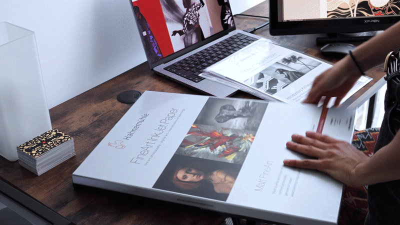
Selecting papers which work for you
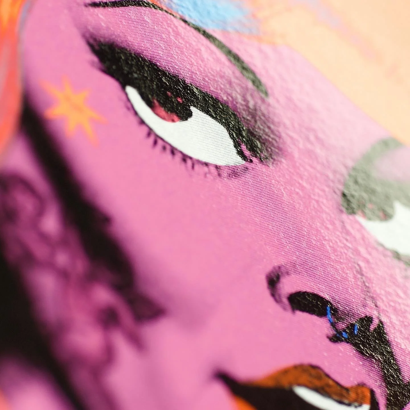
Understanding which papers work for you, based on their textural and longevity qualities, will make all the difference for your art printing experience. My personal favourite make is Hahnemühle, who contribute over 400 years of knowledge and expertise to crafting archival papers with beautifully textured and fibrous qualities (the closest I’ll ever get to the handmade lokta papers I use in lino printing). Researching acid-free archival papers can be confusing, so here are my tried and tested favourites to help you make a head start…

All-time favourite: German Etching (310gsm)
A heavyweight paper with white finish and a velvety tactile feel, pairing colour vibrancy and intensity with a luxurious feel across my entire print portfolio. Pictured is a print of ‘Guiding Light’.
Favourite newcomer: Bamboo Gloss Baryta (305gsm)
A natural paper crafted from 90% bamboo fibres, with a lightly textured surface – a popular choice for art collectors who prefer glossy over matte or satin finishes. Pictured is a print of ‘Thoughts Become You 01’.

Favourite textures: Bamboo, Hemp & Agave (290gsm)
Natural fibre papers with varying degrees of felt-like textures, bringing out a uniquely raw quality especially for black-heavy prints. Pictured is a print of ‘Dyad’ in Agave.
Favourite glossy: FineArt Pearl (285gsm)
A classic and versatile staple for any home print studio, this pearl-gloss paper is ideal for photographic and fine art prints alike with its delicately textured surface, bright white finish, and vibrant colour reproduction. Pictured is a print of ‘Boundless’.
Top tips for photographing, packing and storing prints
Achieving high quality prints is only half the battle won, because the decisions involved in photographing, packaging and storing them can make or break your entire process.
Firstly, equip yourself with the right content creation tools to tell your story and to let your work speak for itself in the best possible light. I’ve always enjoyed the process of photographing my prints close-up, using a macro lens to capture every textural quality and bring my prints to life. My recent favourite, which was used to make the visual content in this blog piece, is the Canon EOS R50 fitted with an RF 85mm F2 IS STM macro lens. Shoutout to its intelligent focus, which has been so useful for video work! When photographing your work, opt for bright natural daylight which won’t distort your prints. If you’re looking to create more stylised or dramatic images, find lifestyle settings which work for you, using natural or artificial soft shadows to help capture detail in exciting new ways.
And finally, protecting your prints means protecting your reputation as an artist. Even though the PRO-300’s pigment inks dry quickly, I tend leave my prints out to air-dry overnight before packaging them up. I’ll then bag them into individual cardboard-backed display bags to keep them dust and scratch free, before tucking them away in a darker corner of my studio with less sunlight exposure. I’ve been sourcing all my packaging materials from Eco-Craft, who offer a wide range of biodegradable and compostable display bags, as well as protective tissue papers, padded envelopes and sturdy tubes. Making sustainable decisions at every step of the way will go a long way towards protecting your credibility as a conscious brand: only then does everything come together to convey the emotions and stories behind your work. ✺
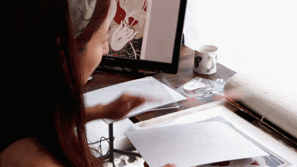
My process signing and packing one of my giclée prints, ‘Thoughts Become You 01’
Canon
Website: www.canon.co.uk
Instagram: @CanonUK
Facebook: @CanonUKLtd
X (Twitter): @CanonUKandIE
LinkedIn: Canon EMEA
YouTube: CanonEurope
Hahnemühle
Website: www.hahnemuehle.co.uk
Instagram: @Hahnemuehle_UK
Facebook: @Hahnemuehle. UK
X (Twitter): @Hahnemuehle_UK
LinkedIn: Hahnemuehle FineArt
YouTube: Hahnemuehle
Discover more ideas